How To Make a Treemap 10/17 – Explanation Guide

As data continues to grow in volume and complexity, the need for effective data visualization techniques continues to rise. We’re dealing with an abundance of information that often becomes overwhelming to digest, analyze, and interpret. Treemaps can help with this abundance of data. They’re fantastic for displaying large amounts of hierarchically structured (tree-structured) information in a compact way. In this article, we’ll cover the details of how to make a treemap. Keep reading to understand everything you need to know about making a treemap.
Understanding the Basics of a Treemap
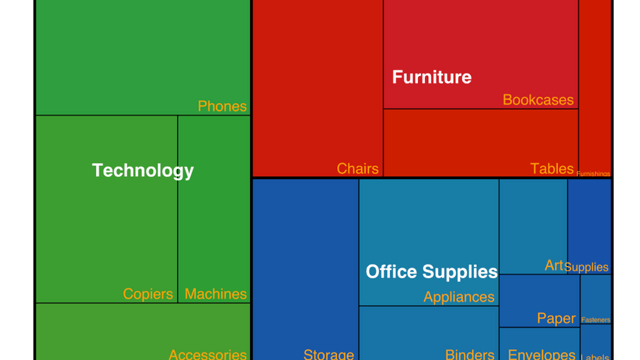
The basic concept of a treemap involves creating a graphical representation of data that effectively portrays the various elements. The figures (often rectangles) used in a treemap are strategically sized and arranged to show the relationship between different data sets. If you want to create a treemap, you need to know your data. It’s crucial to understand what you’re looking to illustrate and select the data accordingly. The hierarchical structure decides the nesting of rectangles, and the size and color of the rectangle encodes information about the measure values associated with each level of the hierarchy.
The color, size, and positioning play a significant role in a treemap, enabling users to understand the information with minimal text to support the visual cues. For example, brighter colors can indicate higher values, while darker shades represent lower ones. Similarly, larger rectangles can denote higher quantities compared to smaller ones. Consider what each graphical element represents to be clear on how to structure your treemap.
Preparing Your Data
Alt text: A business professional prepares data for a treemap chart on a laptop.
Before you dive into the process of making a treemap, it’s essential to prepare your data appropriately. This primarily involves collecting and arranging your data in a hierarchical structure. This structure forms the basis for determining how your treemap will appear, affecting the placement, size, and colors of various rectangles.
It’s also important to clean your data before starting the treemap creation process. This entails removing any unnecessary data points, errors, or inconsistencies that may distort the visualization. Keep in mind that the accuracy of your data is crucial for the credibility of your treemap.
Designing Your Treemap
Once you have your data prepared, it’s time to start designing your treemap. This starts with choosing the hierarchy you’ll use. The hierarchy you choose will depend on the data you’re using and what story you’re trying to tell. Choosing the right hierarchy is critical, as this will determine how your data is broken down and visualized.
Next, you’ll need to think about color. The colors you use in your treemap can greatly impact how your data is interpreted. Be strategic with your color choices. Use contrasting colors to differentiate between different levels of data, and consistent color themes to group similar data together. Remember that color isn’t just for aesthetics; it’s a valuable tool for conveying the meaning of your data.
Lastly, remember to take care of the labeling. Labeling plays a significant role in communicating the information contained in your treemap. Whether it’s labeling the hierarchy levels, the rectangles, or the legend that explains your color scheme, effective labeling can significantly enhance the readability and understanding of your treemap. In the process of how to make a treemap, labeling is an aspect that should not be overlooked.
Evaluating Your Treemap
Alt text: An example of a finished treemap chart with blue, teal, green, and orange rectangles.
After the design phase, you need to take the time to evaluate your treemap. This includes looking at the readability, effectiveness, and overall aesthetics of your visualization. It may be helpful to show your treemap to others and ask for feedback. Another person’s perspective may offer you insights or pinpoint areas that you had overlooked. It’s fundamental to scrutinize the newly created treemap carefully since this data visualization technique will be used as a communication tool to convey important information.
Consider whether your treemap effectively communicates the information you’re trying to impart. Could a person unfamiliar with your data understand the information in your treemap? If not, think about what adjustments you can make to increase its readability and comprehensibility.
Altogether, creating an effective treemap involves understanding your data, planning your design, and meticulously implementing your process. As we’ve seen, there’s a blend of technical skills and creativity involved. So whether you’re a newbie or a pro in this field, with a clear goal in mind and the right steps, you can create a treemap that effectively communicates the intricate layers of your data.


